Executive Summary - Ideal Protein Bar Aisle Concept
Overview
This study suggests that the ideal protein bar aisle is not defined by large displays or heavy signage. Instead, shoppers respond best to an aisle that is easy to navigate, logically organized, visually clean, and quick to shop. The strongest design cues from the interviews point to a shelf that helps shoppers compare options on the factors they care about most: flavor, protein content, price, and familiarity.
Across the study, shoppers most often noticed product grouping, product location, and overall shelf organization, while common frustrations centered on difficulty finding the desired item, disorganized shelf layout, missed products, and inconsistent availability. Promotions matter, but mainly when they simplify the decision by signaling value. Participants were more responsive to price-led shelf tags and sale cues than to elaborate signage or cluttered displays.
For Power Crunch specifically, the biggest opportunity is not convincing shoppers that the product belongs in the category — it is making the brand easier to see, easier to understand, and easier to try. Visibility, shelf placement, clear nutritional communication, and trial-oriented promotions all emerged as important levers for improving trial and consideration.
Executive Summary
The ideal protein bar aisle should be built around clarity over clutter. Shoppers want to enter the category and quickly understand where to look, what distinguishes one option from another, and which products offer the best balance of taste, nutrition, and value.
The most effective aisle layout therefore uses clear product grouping, consistent facings, strong visibility for key brands, and clean shelf-edge promotions. Rather than relying on oversized displays, the aisle should help shoppers make a fast comparison between bars by making protein grams, flavor, and pricing easier to scan. This is especially important in a category where many products compete visually and shoppers often default to familiar brands unless a competing option is easy to notice and easy to justify.
Power Crunch has a strong opportunity when it is placed where shoppers can easily see it, especially at eye level and within the main protein bar set rather than in a harder-to-find location. The study indicates that trial is more likely when the product is visible, stocked consistently, and supported by simple value cues such as coupons, sale tags, or first-purchase incentives.
Ideal Aisle Concept Image
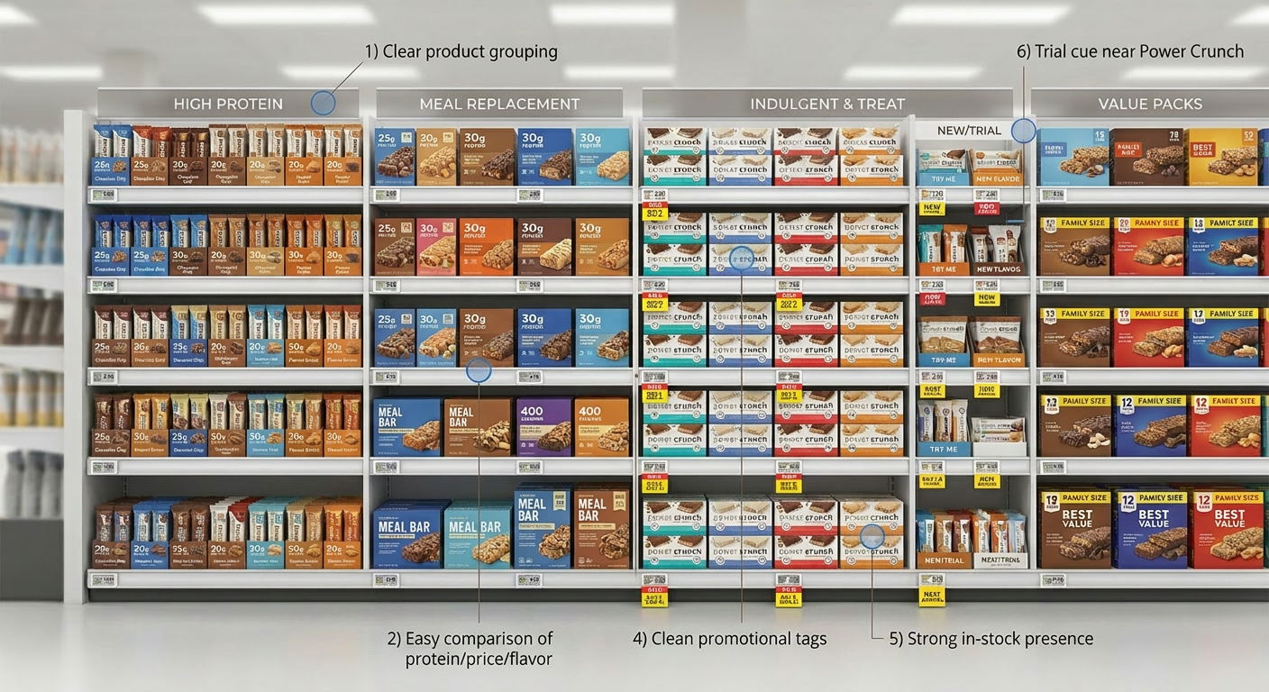
Image Annotations
The concept image includes numbered callouts that reflect the most important merchandising implications from the study.
-
1. Clear product grouping
Bars are organized into intuitive blocks by shopper need so the shelf is easier to scan and shoppers can find the right option faster. This responds directly to the study finding that product grouping and shelf organization are among the most noticeable and helpful shelf features. -
2. Easy comparison of key information
The layout is designed so shoppers can quickly compare the cues they care about most: protein content, flavor, and price. This reflects how participants described making trade-offs at shelf between nutritional value, taste, and cost. -
3. Eye-level placement for Power Crunch
Power Crunch is positioned in a visible, high-traffic part of the set because the study showed that lack of shelf visibility is one of the biggest barriers to consideration. Eye-level placement increases the chance that the brand is noticed and evaluated. -
4. Clean promotional tags
The shelf uses simple yellow sale tags and value markers instead of cluttered signage. Participants consistently indicated that promotions and price cues are more influential than heavy displays or elaborate in-store materials. -
5. Strong in-stock presence
The concept shows full facings with minimal gaps because inconsistent availability and missing products were common sources of frustration. A well-stocked shelf reduces search effort and supports conversion. -
6. Trial cue near Power Crunch
A small trial-oriented area sits near Power Crunch to represent tactics like first-purchase coupons, free samples, or trial incentives. This is based on findings that trial is more likely when visibility is paired with a simple reason to try.
Why These Annotations Matter
Together, these callouts show that the ideal aisle is designed to reduce effort, support comparison, and encourage trial without overwhelming the shopper. The role of merchandising is not just to create visibility, but to make the category easier and faster to shop.
Business Implications
For retail partners, the category opportunity is to make protein bars easier to shop rather than simply more visible. Better organization, fewer gaps, and more intuitive grouping can improve shopper confidence and reduce missed purchases.
For Power Crunch, the clearest merchandising opportunity is to improve shelf visibility and trial conversion. Eye-level placement, stronger nutritional communication on pack, and simple promotional support would likely do more to improve trial than broader awareness tactics alone inside the store.
Bottom Line
The perfect protein bar aisle is a shopper-efficient aisle: organized, visible, stocked, and easy to compare. The winning shelf does not overwhelm shoppers — it helps them decide quickly. For Power Crunch, success at shelf depends on being easier to notice, easier to evaluate, and easier to try.